Reporting Options for SharePoint 2010 Dashboards

The Microsoft marketing team must have some sort of obsession with the letter “P” and the words “Point” and “Power” because I have found myself tounge tied multiple times when attempting to recite the three main reporting options for SharePoint dashboards. They are:

  • Power View
  • Performance Point
  • Reporting Services

If you are familiar with MS Office Suite’s Power Point and Excel’s Power Pivot add-on then you can begin to see the redundancy in Microsoft’s naming conventions. Can you say Power View,  Power Pivot, Performance Point, Power Point five times fast?  

Each of these reporting options have varying degrees of flexibility and limitations and are therefore appropriate for different uses. I can’t honestly say that I have a strong preference for any one of these options. I enjoy the higher degree of control and advanced capabilities that are available in reporting services but I also appreciate the great ease of use that Power View provides. I will avoid a long sales pitch that list all of the capabilities of each reporting tool ( you can read that on the MS website) and instead I will focus on the major contrasting features that I’ve noticed so far.

Power View Pros

  • This tool is extremely easy to use and intuitive.
  • The tool incorporates automatic formatting such as the addition of a scroll bar when the data extends beyond the page.
  • Power View reports are visually appealing making presentations captivating and impressive.
  • There is the ability to export to Power Point, enhancing the presentation usability of this tool.

Power View Cons

  • There are no Excel export capabilities – It’s a sad day for Excel lovers. This tool will probably prove to be too limiting for users who would like to manipulate the data on other platforms.
  • No Pie chart capabilities exist. This may seem like a minor offense…that is until you really need a pie chart.
  • No drill down capabilities exist

Performance Point Pros

  • Dual Y axis functionality exists in Performance Point. You may chart three different variables on your graphs using a left and right axis measure along with the horizontal axis measure.
  • Decomposition tree functionality allows the user drill down to the details of the data numerous times.
  • KPI capabilities for score cards.
  • Pie chart capabilities.

Performance Point Cons

  • Dual Y axis functionality is limited to percentage. Often it is beneficial to include three measures on a graph. You may want a count on the left axis, time on the horizontal axis, and a different count on the right axis. Unfortunately you will be limited to having a percentage on the right axis because Performance Point cannot aggregate a non-percentage number on this axis.
  • Bar chart reports may extend to a second page. The user can’t easily tell that there is a second half of the report on a hidden page and if they do click to the second page the bar chart will auto-magically re-scale to fit the new set of data which is visually misleading.
  • The layout is more limited than a Reporting Services report.

Reporting Services Pros

  • Can deliver the report through SharePoint dashboards, as automated email attachments or links, or as an alert based subscription.
  • Greater flexibility and less design constraints than other reporting options.
  • Multiple data sources are easily combined into one report.

Reporting Services Cons

  • Drill down functionality is not automated like it is in Performance Point.
  • Not as easy to use as other reporting tools and dashboard creation is more complex.

As you can see from this assessment, there is no clear “winner” here. You will have to analyze your user base to determine their needs and decipher which reporting tool is the best fit. And remember, you don’t have to choose just one. A user’s SharePoint based dashboard can easily accommodate reports from all three tools.

Please feel free to comment. Happy programming!

Advertisement

Business Intelligence User Adoption: Baby Steps

In the past I’ve written a few posts that discuss dealing with the challenge of user adoption when introducing a new business intelligence solution.

Recently I have encountered some scenarios that have challenged my ego and my desires to produce solutions that I feel are extensible and efficient. I continue to learn more about the psychology that is involved when users are asked to abandon their old processes and adopt a new (and in my opinion better) way to accomplish their tasks. So here is my dilemma: I can either continue with my stubborn ideas of implementing best practice solutions or I can bend (can you do the limbo?) and design a process that caters to the users’ comfort levels.

Which one to choose? In this scenario you would need a significant amount of power and influence within your organization to override the user preferences for their work tasks (covering many departments throughout your organization) and replace those processes with your own design and plan. In addition, even if you happen to have this type of clout at your organization this iron fist approach will likely just cause resentment and rebellion – resulting in little to no user adoption.

Baby steps…You’ve done your research, you see multiple ways that tedious manual processes can be streamlined, but your users aren’t quite ready to make this leap. If you are like me this may be challenging. You may be thinking “really, you want me to implement a design that I don’t think is the best solution?” and my humble reply is yes, sometimes. I swallow hard as I write this because admittedly I am still having trouble accepting this concept.

Selling your solution to the users in your organization is a psychological process as much as it is a technical process. Consider this scenario: Users currently present KPI trends and results to executives based on manual entry into spreadsheets. They may incorporate some charts and include some complex macros that beef up the technicality of the spreadsheet, but ultimately they are still relying on manual entry. To me this method screams risks of human error, potentially lost data, lack of historical storage, and difficult data retrieval… Ahhhhh!

From my perspective I see the best solution for generating these KPIs in a consistent and reliable manner is to pull the data from the sources into the data warehouse and then generate automated reports or create dashboards for users and executives. (Seems obvious right?) However the reality is that for most end users this would be a dramatic transition, even if it ultimately means less work. They may also be worried about their jobs no longer being necessary. So, it may be going against everything you feel is “right” about a business intelligence design but I recommend taking baby steps here.

First you may want to try a simple solution that utilizes your data warehouse while still allowing the user to remain in complete control of the data that is inserted and reported on. If they are used to using a spreadsheet as their data entry point then a possible solution is to provide a SharePoint list that resembles their current data entry format. Allow the users to continue their manual entry while also becoming familiar with the SharePoint structure (or other collaboration BI tools you may be using). You will be able to extract this data into your data warehouse and generate reports/dashboards while also maintaining history.

The lesson: Don’t take away all of the users’ control at once. Trust is a slow process and ultimately you need your users to trust the data that lives in your data warehouse. When they are able to create useful reports by pulling the data from the data warehouse (that they essentially manually entered) then they will slowly grow an affection for the structure and will hopefully over time begin to ask you how other processes can be streamlined. You may be the BI guru, but ultimately you users will end up being the ones who set the pace.

How to Organize Data Using an Unpivot Function

When you are constructing your data warehouse you will likely encounter data from multiple data sources, some of which have data in undesirable formats. For example, some database tables might be populated from Excel sheets that weren’t exactly designed to fit cleanly into a table, much less a data warehouse table. A budgeting Excel sheet that needs to be imported may look something like this:

Image

This budget data will display as an identical table and structure if no transformations are made during the import. As you can see, this is not an extensible design and it definitely doesn’t belong in a data warehouse without some alterations. As the budget years are added the ETL process will need to be changed to handle the new columns. This will also grow the table to an unmanageable size over a period of many years.

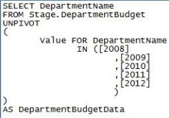
An easy solution to this dilemma is to use the UNPIVOT function to restructure the data and organize it in a manner that can be used in your data warehouse. After you have extracted the data in this budget Excel sheet into a staging table you will be able to reorganize it. Using our basic table example the UNPIVOT function would be:

Image

The PIVOT function will take the rows in a table and pivot them into columns. So intuitively, the UNPIVOT function will do the opposite; it takes the columns in a table and pivots them into rows. After running the above UNPIVOT function your data set will become:Image

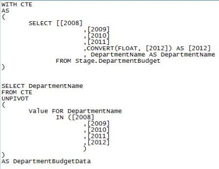
This seems easy enough, but remember each column that is to be pivoted into a row must have matching data types and sizes. When your data types and sizes don’t match exactly you must first convert all of your columns in your select statement to have a matching data type before running the UNPIVOT function. Mismatched data types could be the result of the source data being incorrectly assigned inconsistent data types. The easiest way that I have found to accomplish this is to first use a common table expression (CTE) to convert the data and then use your CTE as the source for your selection in your UNPIVOT function. 

Using the above example let’s assume that the 2012 data is a varchar(25) and the other yearly data is a float data type. The new UNPIVOT script would look like:

Image

This method is easy to read and understand, so for coding clarity I like to use it. I’m sure there are multiple ways to solve this type of issue so please feel free to comment and share any other ways that you have found that work well for you.

I hope this has been helpful, have a great day!

Why working in IT is so Awesome!

We get the best and newest PC equipment

Creativity is encouraged and rewarded

We get the opportunity to make other people’s jobs easier

We can work from home…or Hawaii even

We are responsible for understanding the engine, not just driving the car

For most of us working often feels like playing (because we are geeks at heart)

We get to embrace our inner nerd

We have our own secret language; Geek Speak

We are never bored; our environment is constantly changing

We are needed

Our skills are valuable

And as a lover of tennis shoes (and a hater of high heels) my personal favorite: Every day is casual Friday


GUID Fix When Copying and Pasting SSIS Packages

In a previous post I discussed how to create and use SSIS templates. One issue that can arise when doing this is that duplicated GUIDs will be assigned to each copied package. This creates identification issues if you utilize SSIS logging.

There are three simple solutions to solve this problem:

1. Manually select the generate new GUID option in the ID drop down box in your package properties.

2. Right click the package name and choose the option to reset all GUIDs within the project. This requires the BIDS Helper add on.

3. Rename your package and a new GUID will be automatically generated.

Is Yelling in a Meeting Productive?

A long long time ago in a place far far away…I’m in a meeting. There is a crucial issue that has been exposed in a highly visible project that I am a part of. What is going through my head you ask? I’m not thinking about the project or how I might contribute a solution to the issues at hand, I’m seriously contemplating walking out of the meeting. Why you ask? Because I am listening to the manager loudly yell accusations at others as he repeatedly slams his fist on the table. “I’m tired of this $%#&, this needs to get solved NOW!”

So I, like many others present, avert my attention elsewhere attempting to ignore this overly emotional and unprofessional display of frustration. Just based on this natural reaction that I had yelling has already proven to be counterproductive. I’m not coming up with brilliant solutions on “how to solve the problem now” I’m zoning out and wondering how this individual can possibly think his display is appropriate. Perhaps he is under the impression that to be heard one must behave this way. I think he is sadly mistaken. I strongly believe that an intelligent person is able to effectively communicate and inspire others by encouraging communication in a respectful manner.

Solving problems and getting things done requires motivation. Correct me if I’m wrong, but I suspect that it is a rare individual that would list “being yelled at” as a strong motivator. In the situation that I describe here the team became motivated when a clear project plan and team structure was laid out by another meeting attendee. The yelling had absolutely no positive effect on the outcome of the meeting and really only served as a waste of time for everyone else.

So, if my opinion isn’t already obvious, yelling is absolutely unproductive in meetings. It is unprofessional, demotivating, and in many cases abusive. We, as humans, are simply not wired to respond positively to being yelled at. If you find yourself in this type of meeting I recommend avoiding responding with the same ridiculous behavior. If the situation is extreme you should have the courage to stand up and remove yourself from the situation. It is possible to get reprimanded for doing so, but I personally would rather take the chance and potentially gain respect for standing up for myself tactfully.


Pros and Cons of SSIS Templates

My previous post covered how to create and use a SQL Server Integration Services (SSIS) template. Now you might be wondering why would I use these templates and what are the dangers of using them?

The Rain (cons): SSIS templates need to be downloaded to every local machine that you will be developing on and, as addressed in my previous post, it must be stored in the assigned template folder that was chosen in your SSIS install.  I recommend saving the original template on a shared network drive to allow for easy access. Also, when you are using your template for a new package you must generate a new GUID, otherwise SQL Server will be unable to differentiate between your new package and other packages with this same GUID.

In my opinion the most dangerous aspect of using SSIS templates is the potential for losing consistency. It is inevitable that your template will require alterations before the completion of a project. In this event you would of course save the altered template on the share drive and instruct your team members to download the new template and update their local copies. Some team members may fail to do this (maybe they are on vacation, or the timing is inconvenient) and continue developing on the old template. As the project manager your perception is that all packages are consistent, but as the project comes together some missing pieces may come to light.

This scenario results in inefficiency due to extra work and package validation – and of course frustration from all angles.

The Rainbow (Pros): Standardization is extremely important in IT projects because (as we all know) the project will continue to grow – Instead of “scope creep” should we say “scope sprint”? Consistency of design helps keep the project extensible and easier to maintain. In addition, if a key team member gets hit by a bus, standardized designs will be easier to document and communicate when other team members need to be trained.

Other than standardization, SSIS templates are highly efficient. Once the initial template is created your developers will be able to start with a package that already has standardized logging mechanisms, control flow tools, and indirect package configurations. As a developer of SSIS packages I’m sure it is clear how much time would be saved if you didn’t have to set these components up with each new package you create.

The Pot of Gold (overcoming the cons): You have the option of taking a precautionary step using a Team Foundation Server (TFS). Your lead developer can utilize TFS source code control and set team standards for downloading updated templates. This product offers the capability to track old versions of the template while allowing a developer to “check out” the package for editing and saving.

This additional step in utilizing templates has the potential to save you and your team from a lot of headaches. Keep in mind that using the TFS product will not solve the problem is team standards are not set and adhered to.

Thanks for reading; I hope this has been insightful. Have a great day!

How to Create and Use SSIS Templates

SQL Server Integration Services templates can be a great time saver when creating multiple ETL packages for your business intelligence solution. In this video I will demonstrate how to create and use these templates.

First you will start a new project. Open SQL Server Business Development Studio, navigate to File > New > Project.

A New Project window will open. Navigate to Business Intelligence Projects > Integration Services Project, name your project and select OK. The name of your project should correspond to your intended use of the template.

Next you will build your template by adding the items from the toolbox that you wish to include. These should be items that will be needed for each use of the template.

You will  now need to save your project in two different ways. First click File > Save Selected Items. Next click File > Save Copy of “project name” As. A Save Copy of Package dialog box will open. Select File System in the Package location box and navigate to the Package Path field. You will want to save your package in this location: (assuming that you have installed SSIS with default settings) C:\Program Files\Microsoft Visual Studio 9.0\Common7\IDE\PrivateAssemblies\ProjectItems\DataTransformationProject\DataTransformationItems\Template Tutorial.dtsx

Now you will be able to access and use your SSIS template. Open a new SSIS project and navigate to the solution explorer pane. Right click on the project and select Add > New Item. This will pop up a box that allows you to select your newly created SSIS template and add it to your package.

There are many great benefits to using SSIS templates as well as some dangers. I will explore each of these areas in my next post. I hope this has been helpful, have a great day!


Accepting Project Failure

Project managers will shudder at the thought of this phrase, but sometimes accepting failure and moving on is the best choice. PMs will hesitate considering their personal reputation, the reputation of the IT team, job security, and sunk costs.

As projects begin to slip past deadlines and go over budget those involved sense the risks that are accumulating. As this continues and executive demands increase it becomes more apparent that the project is in serious trouble. Systems are not seamlessly flowing, technical implementations are not working, and the roles of the project team members are becoming fuzzy. When is it time to pull the plug?

Hind sight is 20/20 as they say and at this point you and your team are probably seeing a much more viable solution than the project that you have currently under taken. It’s time to take out your ROI and risk assessment calculators.  Also it’s a good idea to review any contracts that you may have signed with vendors for this project.

Consider this: How much have you already spent versus how much more will it likely cost to complete this project? Obviously the original time estimates were inaccurate so try to use more realistic estimates based on the pace of the project so far.

Can you get out of your vendor contracts?

How much will an alternate solution cost? Remember REALISTIC estimates here.

Is it possible to get the project back on track?

There are hundreds of books that outline the reasons why IT projects fail. Use some resources to pinpoint what may have happened in this project to determine if you should call it quits or attempt to remedy the situation.

In the end, if the project is a failure you have to accept it, deal with this reality, and learn from your mistakes. It may be a good idea to revamp your project team and find an experienced PM mentor to help plan for round 2. This will be your opportunity for redemption where you will be able to plan and manage the project in a way that increases the chances for success.

Dimensional Modeling

When designing your business intelligence solution your data model should coincide with the way that your business analysts interpret your business structure. Now, the goal here is to hide the complex technicalities. You’ll do this by creating an OLAP model that allows your analysts to create intuitive structured queries. In short, your analysts should be able to query your data warehouse in the same way that they would ask business questions.

Business Intelligence is used to measure aggregations (which are facts) across dimensions. This is the ideal modeling used in the BI environment. The dimensional model is designed using specific business process areas. You may decide to track sales amount as a fact using dimensions such as product or store number or sales date to give meaning to those facts.

Measures or facts are numeric data that corresponds to the questions that your analysts are asking. Facts can point to a record in a dimension table that will give meaning to the data. Common facts include dollar values, sales, and revenue.

Dimensions create the anchor when investigating a fact. An analyst may wish to view sales on a specific date for a specific group of customers. This would require the analyst to create a query that links the Sales fact table with the customer and date dimensions. Without this ability the facts would simply be unstructured facts. The Date and customer dimension allow for filtering, grouping, and labeling to narrow down query results.

This example of a fact table displays how the measures of a customer account are tied to the customer dimension. Each measure will have its own aggregation rule such as sum, average, min, or max. The aggregation rules are defined by the ways the business chooses to compare the values of the measure. In this example I display a monthly average balance attribute. Your business may be interested in a yearly average rather than monthly. In addition, the account rating attribute will be calculated using the pre defined business rules for determining an account rating. It is important that these rules are clearly defined and communicated to your analysts so that the true meaning of the data is understood.

This example of a dimension table displays the details of a customer. It includes attributes that describe business interests about the customer. The customer dimension will tie to multiple fact tables to provide a clear image into the details of customer interactions with the company. For example, the CustomerID shown above clearly links to the FactAccount table shown above.

Dimensional hierarchies define a set of parent-child relationships between attributes within a dimensions. A dimension hierarchy includes levels that can roll up from child to parent. A dimension can have more than one hierarchy. The date dimension example shown can include multiple hierarchies such as “Day > Month > Year”, “Day > Week > Year”, “Day > Month > Quarter > Year”, etc. The specific hierarchies that you will include depend on your internal business needs.

I hope this has been a helpful explanation of dimensional modeling. Have a great day!